RIC - Refrigeration Industries

Welcome to RIC
Logo History
Logo History
1973 – 2004

The original RIC logo was created during the company’s inception in 1973. Certain elements of the logo can be seen in the present day one, including the cog, representing industrial process.
2004 – 2009

In 2004, RIC was rebranded as RISCO to reflect the addition and growth of the cold stores sector in which it was heavily involved. The logo was relatively short-lived as it struggled to keep pace with a company that was starting to outgrow it’s regional reach and starting to branch out onto the international stage.
2009 – Present Day
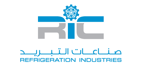
The RIC brand mark as it stands today was launched in 2009. It symbolizes the management and general restructuring that the company has gone through in the last few years.

The logo is based on a figure holding the letter R for Refrigeration and C for Company. The gear on the head symbolizes the Industrial part of RIC and the snowflake is our Refrigeration core business.
We are everything that this logo symbolizes – a holding company that, within it, houses other companies which are capable of handling all aspects of refrigeration and industrial works.
The global aesthetics in the logo reflect the new management’s desire to take the company from a local to a worldwide arena.
“Pioneering Effective Solutions through Pragmatic and Progressive Approaches”

